
Theming

Notice

This page is archived and might not reflect the latest version of the FlutterFire plugins. You can find the latest information on GitHub:

https://github.com/firebase/flutterfire/blob/master/packages/flutterfire_ui/doc/auth/theming.md

FlutterFire UI widgets are built on top of Material and Cupertino design patterns provided by Flutter.

To provide consistency across your application, the FlutterFire UI widgets depend on the ThemeData or CupertinoThemeData instances provided to your MaterialApp or CupertinoApp widget.

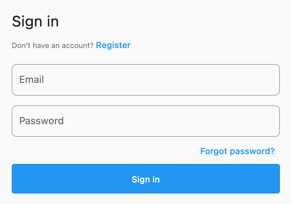
For example, the SignInScreen widget with an email provider, wrapped in a MaterialApp will use the following widgets:

class FirebaseAuthUIExample extends StatelessWidget {
@override
Widget build(BuildContext context) {
return const MaterialApp(
home: SignInScreen(
providerConfigs: [
EmailProviderConfiguration(),
],
),
);
}
}

This will render a screen with the default Material style widgets:

FlutterFire UI Auth Theming - default email form style

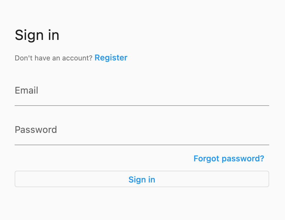
To update these styles, we can override the ThemeData provided to the MaterialApp. For example, to apply a border to the input fields, we can override the InputDecorationTheme:

class FirebaseAuthUIExample extends StatelessWidget {
@override
Widget build(BuildContext context) {
return MaterialApp(
theme: ThemeData(
inputDecorationTheme: InputDecorationTheme(
border: OutlineInputBorder(
borderRadius: BorderRadius.circular(8),
),
),
),
home: const SignInScreen(
providerConfigs: [
EmailProviderConfiguration(),
],
),
);
}
}

The UI widgets will respect the updated theme data, and the UI will be reflected to match:

FlutterFire UI Auth Theming - email form outline border

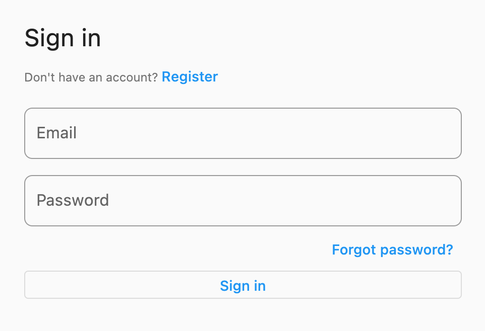
Furthermore, we can customize the button used in the UI by overriding the OutlinedButtonThemeData:

class FirebaseAuthUIExample extends StatelessWidget {
@override
Widget build(BuildContext context) {
return MaterialApp(
theme: ThemeData(
inputDecorationTheme: InputDecorationTheme(
border: OutlineInputBorder(
borderRadius: BorderRadius.circular(8),
),
),
outlinedButtonTheme: OutlinedButtonThemeData(
style: ButtonStyle(
padding: MaterialStateProperty.all<EdgeInsets>(
const EdgeInsets.all(24),
),
backgroundColor: MaterialStateProperty.all<Color>(Colors.blue),
foregroundColor: MaterialStateProperty.all<Color>(Colors.white),
),
),
),
home: const SignInScreen(
providerConfigs: [
EmailProviderConfiguration(),
],
),
);
}
}

The button will now respect the updated theme data and display a styled button instead:

FlutterFire UI Auth Theming - email form custom button style